A beloved American institution just made a decision that has the internet up in arms. After decades of maintaining one of the most recognizable logos in casual dining, a major restaurant chain has unveiled a dramatic rebrand that strips away everything customers thought they knew about the brand’s identity. The reaction has been swift, brutal, and overwhelmingly negative, with social media erupting in a chorus of disappointment and outrage that speaks to something much deeper than just aesthetic preferences.
The Great Logo Transformation
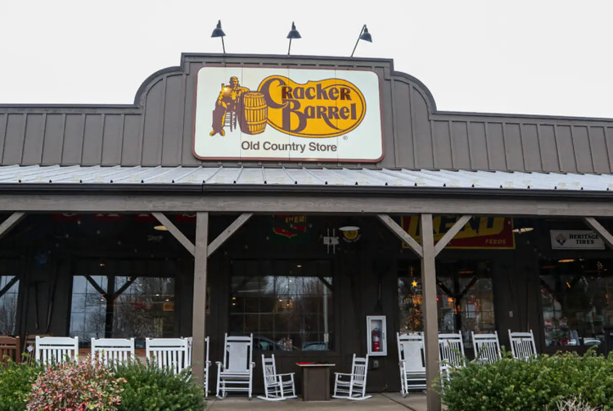
Cracker Barrel Old Country Store, the Tennessee-based restaurant chain known for its country cooking and gift shop atmosphere, recently revealed its new corporate logo to the world. The transformation is nothing short of dramatic – and according to critics, nothing short of devastating.
The original Cracker Barrel logo was a masterpiece of nostalgic Americana. It featured an ornate design with a distinguished gentleman in period dress sitting contemplatively beside the iconic barrel that gives the restaurant its name. The logo was framed with decorative elements that evoked the charm of a bygone era, complete with the company’s traditional slogan woven into the design. It was busy, detailed, and unapologetically old-fashioned – exactly what customers expected from a brand that built its reputation on country store nostalgia.
The new logo, by stark contrast, is a study in minimalist brutality. Gone is the gentleman, vanished are the decorative flourishes, and disappeared is the warm, inviting complexity that made the original so memorable. In its place stands a stark, simplified design that reduces the entire Cracker Barrel brand to its most basic elements: the name and a barrel. Nothing more, nothing less.
The visual impact is immediate and jarring. Where the old logo invited customers to linger and discover small details, the new design can be absorbed in a split second. Where the original suggested stories and tradition, the rebrand communicates efficiency and corporate streamlining. It’s the difference between a hand-carved wooden sign and a highway billboard – both serve the same basic function, but only one has soul.
Corporate Defense Meets Public Outcry
CEO Julie Felss Masino has been vocal in defending the controversial rebrand, claiming that customer reception has been overwhelmingly positive. Speaking to Good Morning America, she insisted, “Honestly, the feedback’s been overwhelmingly positive that people like what we’re doing.” Her confidence in the rebrand suggests that either the company is receiving dramatically different feedback than what’s visible on social media, or there’s a significant disconnect between corporate perception and public reality.
But venture onto any social media platform, and the story tells itself differently. Twitter, Facebook, Reddit, and Instagram are flooded with criticisms ranging from disappointed to downright furious. The disconnect between Masino’s claims and the visible public reaction has only fueled more criticism, with many questioning whether the company is truly listening to its customers or simply hearing what it wants to hear.
The backlash has been both immediate and sustained. Within hours of the logo’s public reveal, hashtags critical of the rebrand began trending, and memes mocking the new design proliferated across platforms. The criticism isn’t just about aesthetics – it’s about what many see as a fundamental misunderstanding of what made Cracker Barrel special in the first place.
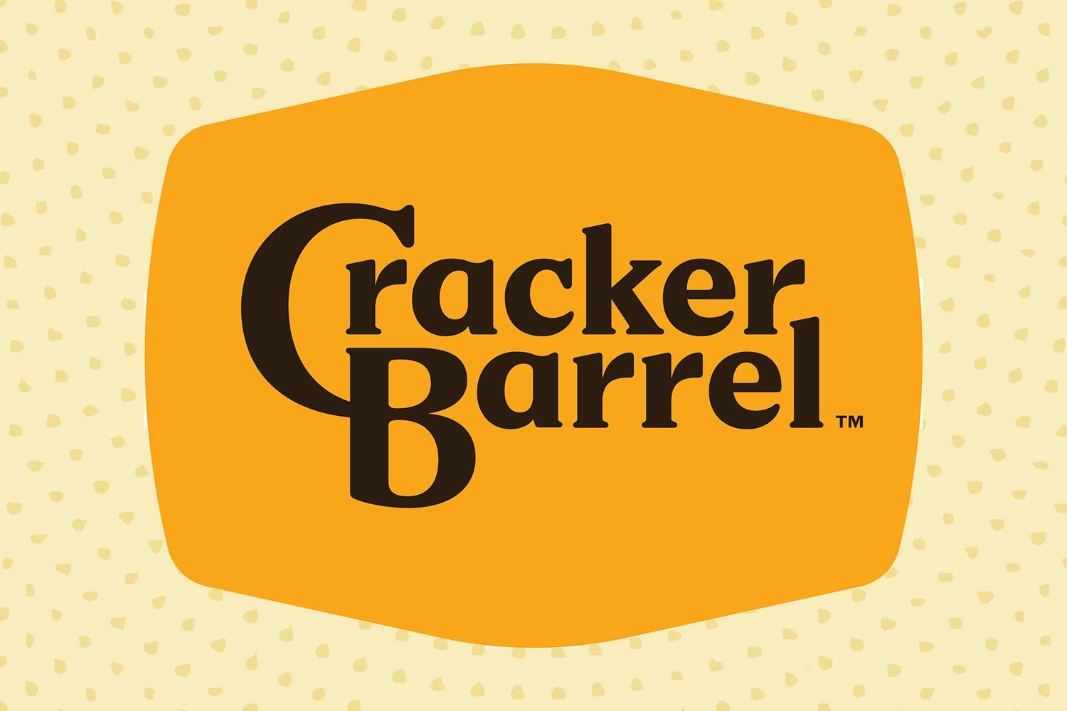
Cracker Barrel’s new logo
The Internet’s Verdict: A Collective “No”
Social media has become the primary battleground for the logo debate, and the results are decisively one-sided. Conservative commentator Collin Rugg captured the prevailing sentiment perfectly in a viral tweet: “I’m just wondering how much they paid someone for this new logo.” The implied criticism – that someone was paid good money to strip away everything interesting about the brand – resonated with thousands of users who shared similar sentiments.
The comments sections tell a story of genuine disappointment from longtime customers. “Almost 90% of all rebranding seems to be genuinely aimed at destroying our souls,” wrote one particularly frustrated user. “The same happened in construction, and now it’s happening in almost every field.” This comment touches on something crucial – the Cracker Barrel rebrand isn’t happening in isolation. It’s part of a broader trend that many people are noticing and actively resenting.
Local reactions have been equally telling. One commenter shared results from their local newspaper’s poll about the rebrand: “The local paper had a write-up about the changes & 90% of the people polled hated it. They all said they might as well go to Bob Evans or Applebee’s down the street. This rebrand has done away with the character & charm Cracker Barrel was known for.”
This last comment hits at the heart of the controversy. For many customers, Cracker Barrel wasn’t just another restaurant – it was a specific experience defined by its commitment to a particular aesthetic and atmosphere. By stripping away the visual elements that supported that experience, the company may have inadvertently communicated that it no longer values what made it unique.
The Broader War on Character
The Cracker Barrel rebrand controversy reflects a much larger cultural phenomenon that extends far beyond restaurant logos. Across industries, companies are embracing minimalist design philosophies that prioritize clean lines and simplified messaging over character and distinctiveness. This trend, often justified in the name of “modernization” and “accessibility,” has left many consumers feeling like the world around them is becoming increasingly sterile and homogeneous.
Architecture provides perhaps the most visible example of this phenomenon. Where cities once featured buildings with distinctive facades, ornate details, and unique character, new construction increasingly favors glass and steel boxes that could have been designed by the same architect regardless of location or purpose. The result is urban landscapes that feel interchangeable and forgettable.
The same trend has invaded retail spaces, where unique local businesses are replaced by chain stores with identical layouts and branding. Home design has followed suit, with social media platforms promoting minimalist aesthetics that prioritize empty space over personal touches like books, artwork, or collections that reflect individual personality and interests.
Even the automotive industry hasn’t been immune. Luxury brands that once celebrated distinctive design languages have gravitated toward similar silhouettes and simplified badging. Jaguar, mentioned by critics as another example of brands “stripping away their beauty,” represents just one of many companies that have traded distinctive character for supposed universal appeal.
The Psychology of Brand Attachment
The intensity of the reaction to Cracker Barrel’s rebrand suggests something deeper than simple aesthetic preferences. For many customers, the original logo wasn’t just a design – it was a symbol of values and experiences that they associated with the brand. The detailed, nostalgic imagery communicated authenticity, tradition, and a connection to American heritage that resonated with the restaurant’s target demographic.
Psychologists who study brand attachment note that consumers often develop emotional connections to visual elements that go far beyond rational considerations. A logo becomes a shorthand for a entire set of associations and memories. When that logo changes dramatically, it can feel like a betrayal of the relationship that customers thought they had with the brand.
This explains why rebrand reactions are often so disproportionately emotional. It’s not really about whether one design is objectively better than another – it’s about what the change represents. In Cracker Barrel’s case, many customers interpret the simplified logo as evidence that the company has lost touch with its roots and is prioritizing corporate efficiency over the unique character that originally attracted them.
The generational divide in design preferences also plays a role. Older customers, who may have stronger associations with the original branding and the values it represented, are more likely to view the change as a loss. Younger consumers, who may be more accustomed to minimalist design trends, might be more accepting of the change or even prefer it.
The Committee Design Problem
One of the most frequent criticisms of the new Cracker Barrel logo is that it looks like it was “designed by committee.” This phrase has become shorthand for creative work that has been sanitized and compromised through too many rounds of input and revision. The implication is that the original creative vision has been diluted until all that remains is something safe, bland, and forgettable.
The committee design problem is real and pervasive in corporate America. When multiple stakeholders with different priorities and perspectives weigh in on creative decisions, the result is often work that satisfies no one completely while offending no one specifically. Risk-averse decision-making tends to favor solutions that are defensible rather than inspired.
In the case of logo design, committees often gravitate toward simplification because it seems like the safest choice. Fewer elements mean fewer things that could be criticized or misinterpreted. Universal appeal becomes the goal, even when that universality comes at the cost of the distinctiveness that made the brand memorable in the first place.
The irony is that this approach often backfires spectacularly. Instead of creating something that everyone likes, companies end up with something that no one loves. The Cracker Barrel rebrand appears to be a textbook example of this phenomenon.
What This Means for Brand Identity
The Cracker Barrel controversy raises important questions about the future of brand identity in an increasingly homogenized marketplace. If successful companies with strong brand recognition can face such backlash for modernizing their visual identity, what does that mean for other businesses considering similar changes?
The lesson may be that authenticity and character are more valuable than corporate leaders realize. In a world where consumers are increasingly skeptical of corporate motivations and hungry for authentic experiences, brands that maintain their distinctive character may have a significant competitive advantage.
Cracker Barrel built its success on being different from other restaurant chains. The original logo supported that differentiation by immediately communicating the brand’s unique positioning. The new logo, by contrast, could belong to almost any casual dining establishment. In attempting to modernize, the company may have accidentally made itself more forgettable.
The challenge for companies is finding ways to evolve their visual identity without losing the elements that made them special in the first place. This requires understanding not just what the brand looks like, but what it represents to customers and why those associations matter.
As the dust settles on this particular controversy, Cracker Barrel faces a choice: double down on the rebrand and hope that customer criticism fades over time, or acknowledge that they may have misjudged what their customers value and consider adjustments. The company’s response to this backlash may ultimately prove more important than the original design decision itself.
The broader implications extend beyond any single company. The Cracker Barrel rebrand has become a symbol in the ongoing cultural conversation about authenticity, tradition, and the price of modernization. Whether other companies take note and reconsider their own simplification strategies remains to be seen, but the message from consumers is clear: not all change is progress, and sometimes what looks old-fashioned is actually exactly what people want.

Adrian Hawthorne is a celebrated author and dedicated archivist who finds inspiration in the hidden stories of the past. Educated at Oxford, he now works at the National Archives, where preserving history fuels his evocative writing. Balancing archival precision with creative storytelling, Adrian founded the Hawthorne Institute of Literary Arts to mentor emerging writers and honor the timeless art of narrative.